
Manchester City
REVEALED: Manchester City unveils new kits style for the Champions League. SEE KITS HERE…
Manchester City, the 2024-25 Premier League champions, have disclosed their own custom font that will be implemented on their uniforms. This development was unexpected.
The typeface was developed in partnership with musician Noel Gallagher, who was previously a member of Oasis and is a lifelong avid supporter of City. The design, which will be employed to indicate the names and numbers of the players next season, is inspired by Gallagher’s handwriting.
The process commenced with Gallagher composing the names and squad numbers of each player in the first-team squad. This information was subsequently transformed into a custom font that will be used on the new City uniforms.

Although it is undoubtedly unique, there is a strong resemblance to the detested Comic Sans.
During the final weeks of the previous season, Manchester City unveiled their new home 2024-25 kit on the same day as their title rivals, Arsenal. On the concluding day of the campaign, City secured the English league title for the fourth consecutive season, a record.
The local “0161” phone dialling code for the city of Manchester is woven into the detail and trim of the jersey from manufacturer Puma.
The hand-drawn typeface will be featured on the new uniform worn by the men’s team in every Champions League and domestic cup fixture next season. Nevertheless, it will not be visible in the Premier League, as the regulations mandate that clubs must choose their kit lettering and numbering from a variety of preapproved design and colour combinations that were implemented last summer.
Numerous significant organisations generate novel custom fonts for their official match jerseys. For instance, Real Madrid recently initiated a new Arabesque lettering design to adorn their new, pristine white 2024-25 home kit.
The results of the unique lettering generated by numerous national teams to accompany their uniform releases have been mixed.
Norway, the national team of City striker Erling Haaland, made a minor stir last year when they introduced a daring typeface that was inspired by ancient Nordic runes to complement their 2024 kits.
Despite the fact that the numbers and letters appear stunning when viewed in isolation, they are exceedingly challenging to read from a distance of more than a few feet, particularly when the players are occupied with the activities of a typical football match.
However, why should the fact that a font is scarcely legible detract from an otherwise delightful piece of creative design?


-
 Manchester City10 months ago
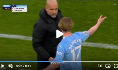
Watch Manchester City best Midfielder Kevin De Bruyne angry expression with Pep Guardiola substituting him in the 68th minute of the match vs Liverpool
-

 Other News1 year ago
Reason why Liverpool player Darwin Nunez was held back by Jurgen Klopp from angryily attacking Pep Guardiola after the final whistle during the match
-

 Arsenal9 months ago
Reason why Bukayo Saka might be forced to retire from football before he turned 24-year-old
-

 Manchester United9 months ago
Main reason Amad was sent off during Manchester United vs Liverpool FA Cup quarter-final match
-

 Arsenal1 year ago
I begged Him to go with Arsenal, but He went with Man United instead of us. William Saliba announced that his £45 million international teammate had chosen to join Man United over Arsenal on a personal basis.
-

 Liverpool9 months ago
Between Liverpool, Manchester City and Arsenal Ian Wright reveals the club who will win the Premier League title this season
-
 Liverpool10 months ago
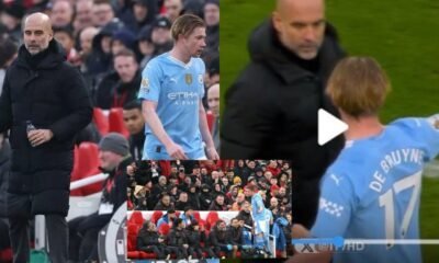
Manchester City manager Pep Guardiola break silence and make responds to Kevin De Bruyne “not impressive angry behaviour” after Man City vs Liverpool substitution
-

 Manchester United1 year ago
Watch Goal Video: Manchester United vs Everton – Alejandro Garnacho scores the best goal of the year with a back flip